LB Dekor
This assignment required me to redesign an existing website. It’s desktop and mobile version.
The goal in this project was to make it look modern, trustworthy to attract new customers and showcase their services, and give the customers a way to connect and schedule an appointment. The page must be easy to navigate, clearly state which services are offered, and convert from visitor to customer.
To do this I first started by going through all the content on the pages and then removing everything that was unnecessary, then creating a structure so everything is easy to find.
How to visually create a website, mobile application that is easy to navigate and has a visual hierarchy that will be able to give the user the facts he needs but also convert him into a customer.
The customer research and testing was at the higer priority for this project.
This is what LB Dekor 's desktop site looked like before.

The new mobil LB Dekor look

Objectives
Create a prototype for a website, it should be user-friendly, visually appealing and effective
in converting visitors into customers.
● Easy to navigate and intuitive for users.
● Present the company's services in a clear way.
● Encourage users to contact the company for a quote or book an appointment.

Purpose
● Why does this feel important/interesting? These were the tasks I had during my lia-
period so they will teach me to create a better understanding of the structure of the
graphic elements in figma.
● Who is the target group? The customers the company that the page is intended to help. Also their
customers, so that they can find a product or product service that suits them.
● What needs does the target group have that your work should help solve? A page that makes the
target group feel that their needs, information and the services offered are of the quality they strive for.

Method
Double diamond
Double diamond can be a more effective choice than, for example, design thinking. Then I can more quickly
start creating prototypes to test the solutions through. As there are already identified
problem areas with the existing page, it is very slow, has an outdated interface, there is
no call to action, graphic elements create an inharmonious layout for headings, text in cards is
formatted to fill the space which creates uneven spaces between the words, etc.
.webp)
Think aloud
Think Aloud is a usability testing method where participants verbalize their thoughts, feelings, and actions while interacting with a product or prototype. It provides direct insight into users' mental models and decision-making processes.
● Uncover Hidden Issues - Reveals problems users encounter that might not be visible through metrics alone, including confusion, frustration, or misunderstandings
● Understand User Reasoning - Exposes why users make certain decisions, not just what they do, helping you understand their mental models and expectations
● Early Problem Detection - Catches usability issues during design/prototype phases when they're cheapest to fix, before development investment
● Rich Qualitative Data - Provides context and nuance that quantitative data misses, with direct quotes and insights you can share with stakeholders
● Cost-Effective Testing - Requires minimal participants (5-8 users typically sufficient) to identify most major usability problems, making it efficient and practical

Interviews
User interviews are structured conversations that gather in-depth insights about user needs, behaviors, motivations, and pain points, helping teams make informed design decisions based on real user perspectives.
● Deep Understanding - Uncover underlying motivations, emotions, and context behind user behaviors that surveys can't capture
● Flexible Exploration - Adapt questions in real-time to pursue interesting insights and probe deeper into unexpected responses
● Build Empathy - Create direct connection with users, helping teams understand the human side of design problems
● Discover Unmet Needs - Identify problems and opportunities users may not have articulated or even realized they have
● Validate Assumptions - Test your hypotheses about users directly rather than designing based on guesses or stereotypes

Personas
Personas are fictional yet data-driven representations of key user segments that humanize research findings, helping teams maintain user-centered focus throughout the design and development process.
● Shared Understanding - Create alignment across teams by giving everyone a common reference point for who they're designing for
● Decision-Making Tool - Quickly evaluate design choices by asking "Would this work for X?" instead of debating abstract preferences
● Prioritization Guide - Help teams focus on features and solutions that serve the most critical user needs rather than trying to please everyone
● Communication Bridge - Translate complex research data into memorable, relatable characters that stakeholders and developers can easily understand and remember
● Prevent Bias - Replace assumptions and "designing for yourself" with evidence-based user representations grounded in real research data

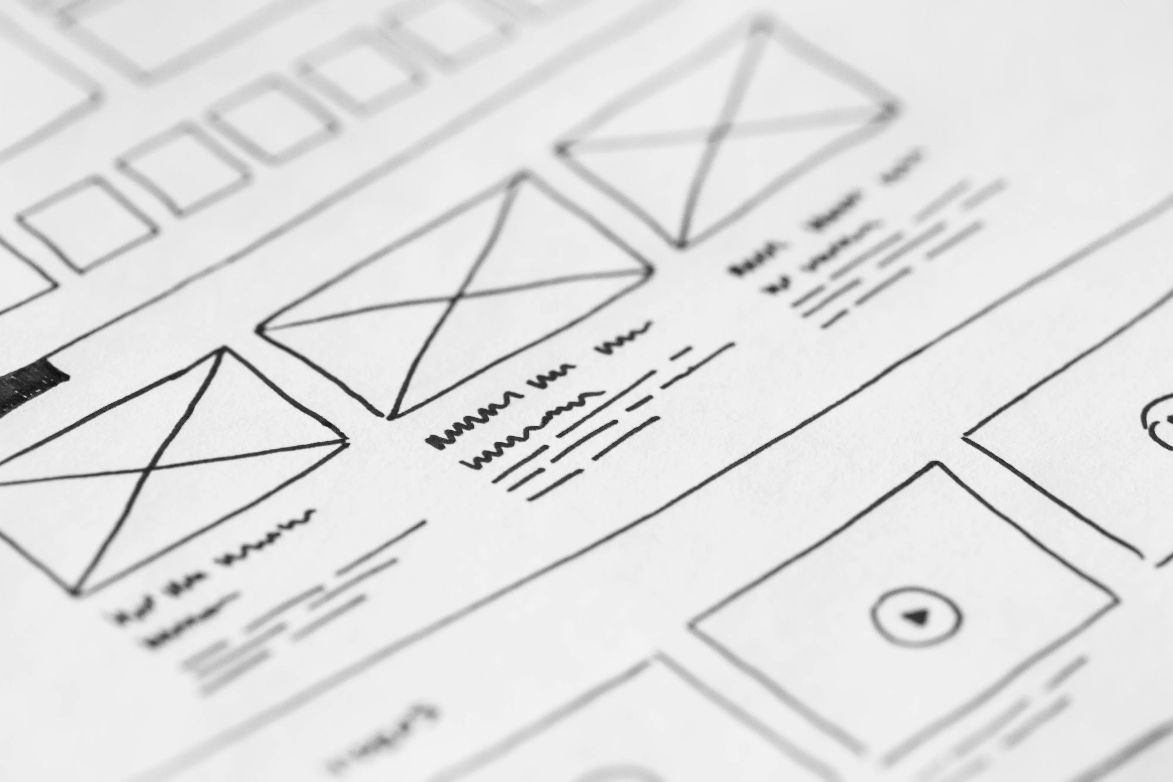
Wireframes
Wireframes are simplified visual blueprints that outline the structure, layout, and functionality of digital interfaces without detailed design elements, enabling teams to focus on user flow and information architecture before investing in high-fidelity designs.
● Fast Iteration - Quickly sketch and modify layouts without the time investment of polished designs, making it easy to explore multiple solutions
● Focus on Structure - Strip away visual distractions like colors and imagery to concentrate on content hierarchy, navigation, and user flow
● Early Stakeholder Alignment - Get feedback on fundamental layout and functionality before committing resources to detailed design work
● Cost-Effective Testing - Validate concepts and user journeys early when changes are cheap, preventing expensive revisions later in development
● Clear Developer Handoff - Provide a functional blueprint that clearly communicates layout logic and interaction patterns, reducing miscommunication between design and development teams
%20-%20stor.webp)
Prototyps
Prototypes are interactive simulations of a product that allow users and stakeholders to experience and test functionality before development, ranging from low-fidelity clickable wireframes to high-fidelity, fully interactive mockups.
● Validate Interactions - Test how users actually navigate and interact with your design, uncovering usability issues that static mockups can't reveal
● Realistic User Testing - Enable participants to experience flows and transitions as they would in the real product, generating more accurate feedback
● Stakeholder Buy-In - Demonstrate vision and functionality in a tangible way that's far more convincing than static designs or verbal explanations
● Reduce Development Risk - Identify and fix design problems before coding begins, preventing costly rework and technical debt
● Design Refinement - Test multiple interaction patterns and animations to determine what feels most intuitive and satisfying before committing to implementation
Purpose
● Why does this feel important/interesting? These were the tasks I had during my lia-
period so they will teach me to create a better understanding of the structure of the
graphic elements in figma.
● Who is the target group? The customers the company that the page is intended to help. Also their
customers, so that they can find a product or product service that suits them.
● What needs does the target group have that your work should help solve? A page that makes the
target group feel that their needs, information and the services offered are of the quality they strive for.
Extra inspection
Where the previous website was reviewed to find strengths and weaknesses.
● Easy to navigate and intuitive for users.
● Present the company's services in a clear way.
● Encourage users to contact the company for a quote or book an appointment.

Problem areas
● Poor language, grammar, sentence structure.
● Mixes lowercase and uppercase letters.
● Uneven spacing in the text.
● No CTA.
● Functions on the page are not used like the blog.
● Exposed images vs. images with background.
● Different line spacing from the title in the info card.
● No privacy policy.
● Difficult to get an idea of the pricing.

Mobil
Landing page
It starts with a small animation of the ui element to give the user a sense that the page is updated and is dynamic but not to advanced.
.png)
Mobil
Booking
I made a pretty simple calendar for schedule an appointment. To see what day and time is free to book. It need tobe developt with a contact fields etc.
But the big one for this was after a bit of research, the boking was not goin to work at this time. The work of every car is hard to work out in advance so the both owners need to be flexibel when thay can book a new car.In the future they welcom the use of a booking system.
The page for booking would need an explanatory text of what they are actually booking. A choice of which service is booked will need to be entered. An alternative is to start choosing a service and after that the selectable dates come up. Another is to first choose a selectable date, then you get the opportunity to choose which service is to be performed where the former are preferred. None of these exist yet. Now you can only select the date and time.
The button for select date could be in a disabled mode before the selections for date, time and service are made, provided that the button is selected at a later stage when the selection of date and time is made. The idea is there but is not implemented in the prototype. Even entering your contact details does not exist and is something that must be introduced. This would probably be good to do directly date, time and service are selected.
An alternative that has been on the mind is to create a login page profile page. It is only in a thought stage yet and has not had time to become more than a thought. There you could follow your service order, see invoices, contact the company and be contacted. Enter your contact details etc.


Personas
From user interviews, surveys and conversations with the two owners of the company, four personas have been created.
That are in Swedish! Since the site will focu on the Swedish peoplein Spanin to Strat with but it will be in English, Spanish and also Portuguese in the future.


Empty State
At times, users will encounter empty states within an application, so I did design this pages so the user can get a clear instructions or actions that guide users on what to do next when there's no content to display.
They prevent users from encountering confusing blank screens, offering context and purpose even in the absence of data.They maintain a visually appealing interface, ensuring that the design remains cohesive and informative at all times.
These are only prepared to give the user a visibility of what is happening if, for example, the internet connection stops being connected, so the user should for an indication of what the error is.
This is how I used the visibility of system state design principle. The states that are created in the project are not completely thought out, but the idea is that they should be included and be clear for the errors that may occur and not just be general.
Testing
There have been several types of tests both larger and slightly smaller but with a significant impact on the navigation on the page but also to create greater clarity in the design.
Here below is just an example of how to clarify the navigation in the footer where to place the chevron icon, also the rotation and how it´s colored.
And I side dropin menu with light vs dark mode.


The choice of colors
The existing page I have started from is based on an all white background color #FFFFFF and text in all black #000000.
With the accent color blue #4253FF.
As well as the colors: yellow #EAFF00, yellow-green #E8F751, blue-purple #4C61FF, light gray #DCDFE2.

Dark Gray #252525
Instead of black #000000, I want to use dark gray #252525 to create a milder contrast and make it easier for the eye against the white background but still maintain a certain contrast. See that in my prototype that some parts of the black text are #000000 but it should be #252525.
The color #252525 will provide a better contrast against the white background color. This makes it easier for users to read and distinguish the text, especially for people with impaired vision or in situations with poor lighting conditions. This can reduce the strain on the eyes and make reading longer texts more comfortable. Many design preferences tend to avoid a pure black and white contrast. By using a dark gray color (#252525) you get a subtle and elegant feel, which can contribute to a more aesthetically pleasing design. It is important to note that the choice of text color and background color depends on several factors, including usability, brand guidelines and user context. It is always good to test and ensure that the contrast and readability meet accessibility standards and meet user needs.

Orange #bd4e2a
I have chosen to use orange #bd4e2a, a secondary color when looking at the color wheel. #bd4e2a can be used to create a unique and recognizable visual identity as well as to limit my color palette so a hierarchy can be created and the user has less colors to be distracted by. I want to try to maintain a uniformity throughout the page through the color and color choices. The color #bd4e2a can provide a strong contrast to other colors and attract attention. It has been used to highlight important elements and to create a visual hierarchy in the design.
Color has a psychological impact on people, color can convey energy, passion or enthusiasm, and can be used to create a positive and engaging user experience. The color could provide a pleasing aesthetic it could simply be attractive to the eye and create an aesthetically pleasing design. However, the choice of color can be subjective and based on personal preference and style.

Light gray #F5F5F5
The light gray color (#F5F5F5) is a neutral light gray color that can function as a base color, which I chose to use for the footer and when the hamburger menu is unfolded. It can be used to give a clean and minimalist feel without being too intrusive or distracting. The color also provides a good contrast against darker text, making it easier for users to read content on a website or mobile app. The light color is also to meet accessibility standards, as it provides better contrast for visually impaired users. It can also give can give a stylish impression.

Accent color
Green #239E6B
Green accent color (#239E6B). is a lively and saturated green color that creates
a strong contrast to many other colors. By using it as a complementary color, you can highlight important elements and create visual clarity.
By using #239E6B as a complementary color, you can guide the user's eyes towards specific areas or actions on a website or app, it is used mainly in the contact form when the user has filled in the fields correctly. It can also be used to emphasize clickable elements or important messages. The color can also evoke positive and calming feelings in users.

Accent color
Blue #2855FF
This blue color is often associated with reliability, security and professionalism. Using this color can help build trust with users. Blue colors can trigger feelings of calm and trust in users, which can be positive for the user experience. The color is used when the user enters their data in the contact form fields as the field is active, subtle but still visual.

Navigation
The existing page I have started from is based on an all white background color #FFFFFF and text in all black #000000.
With the accent color blue #4253FF.
As well as the colors: yellow #EAFF00, yellow-green #E8F751, blue-purple #4C61FF, light gray #DCDFE2.

Logo placement
The logo on the web page is left-aligned as it is what you expect and the recognition of the tests that nngroup has carried out is the most logical. If you choose to have the logo centered, it is according to nngroup.
However, on the mobile version, the logo is placed centered at the top of the screen.
”The average lift in brand recall was thus 89% by havingthe logo on the left instead of the right. This is one of thebiggest differences we have seen in user-experiencemetrics from such a small layout change.”
https://www.nngroup.com/articles/logo-placement-brand-recall/
”Comparing the failures to navigate in the two conditions, users were 6 times as likely to fail to navigate to thehomepage in a single click when the site logo wascentered versus left aligned”https://www.nngroup.com/articles/centered-logos/?lm=guidelines-for-visualizing- links&pt=article
”In other words, logos should lean left. We speculate thatthe reason for this difference is that left-aligned logos arethe norm and what users expect, and so the more a designdeviates from the norm, the worse the user experience.”
https://www.nngroup.com/articles/centered-logos/?lm=guidelines-for-visualizing- links&pt=article

Breadcrumbs
Bredcrums have been used to give the user direct visual navigation of where they are on the page. Now this project is relatively small with few sub pages so you can ask if they are necessary, but as the accessibility directive expands so why not facilitate as much for all users as possible. Since it also feels like clickable navigation and does not take up much screen space, the choice was that it should be included. However, there is a risk of confusion with the pages' headings and that they become a bit of cake on top of cake.

Typeface
I have chosen to use the following fonts on the page.
Header:
Abril fatface
Although these fonts don't have multiple styles, they are a great font for headings.
"The thin serifs and clean up curves lend the typeface a
refined contact that gives any headline an elegant visual
appearance.”
https://www.dafontfree.io/abril-fatface-font/

Body:
Avenir next
Body - Avenir next is a sans font that is used here as the body text, the text on the page you will read the most from, where it is important that the text has a high level of readability. In principle, I could imagine building the entire page on just these fonts but chose more to create a larger hierarchy.
"LG currently uses the Avenir Next design on cell phone buttons because of its excellent readability - something very important in everyday use and emergency situations. The British television channel BBC2 recently shifted its corporate typeface from the Gill Sans® font to the Avenir Next font, breaking away from the typographic image formerly used by all BBC channels.” https://www.fonts.com/font/linotype/avenir-next/story
"LG currently uses the Avenir Next design on cell phone buttons because of its excellent readability - something very important in everyday use and emergency situations. The British television channel BBC2 recently shifted its corporate typeface from the Gill Sans® font to the Avenir Next font, breaking away from the typographic image formerly used by all BBC channels.”
https://www.fonts.com/font/linotype/avenir-next/story
Menu:
Inter
Rasmus, the creator behind the font, is an old childhood friend from my hometown Trollhättan, so why choose another font? Maybe not quite the reason why I chose them. Since the font is designed to work and create a high readability on small screens from the start with a size of 11px, they felt like a natural choice to use.
Thoughts have been made to also use this font for all body text as well, which would and maybe will happen in a V2.0 to create even greater recognition of only using two type families but with different font styles. And then remove and replace Avenir next with Inter.
"Inter is a typeface carefully crafted & designed for computer screens."
https://rsms.me/inter/

Grids
Mobile
For the mobile version, I have chosen to create a 4-column grid system of the type stretch, margin 16 and gutter 16.
Fast and easy layout
A 4-column grid simplifies the layout process by providing a clear grid to work from. This helps to place and adjust design elements quickly and efficiently.
Better proportions
A 4-column grid provides a balanced layout with better proportions for the visual design elements. This can make the design more aesthetically pleasing and easy to read.
Responsive design
4-columns is useful for creating a responsive design. It provides enough flexibility to adapt the design to different screen sizes and devices.
Device compatibility
With a 4-column grid, you can create designs that can easily adapt to different devices. It makes it possible to create a unified experience across different platforms. Since I chose 4, they can easily be doubled up to the 12-column system that was used in the desktop version.
Creative freedom
Even though it's only a 4-column grid, it still leaves room to be creative with the design. It provides a basic structure to build on, while giving you the opportunity to experiment with the placement of elements.
Responsive design
4-columns is useful for creating a responsive design. It provides enough flexibility to adapt the design to different screen sizes and devices.
Desktop
I chose a 12-column system of type to stretch, margin 100, gutter 32.
Consistent layout
Using a 12-column grid allows you to create a consistent layout for your design elements. This helps create a visually balanced and coherent design.
Efficient use of space
By using a margin of 100 and a gutter of 32, the space is used efficiently and ensures that the design elements do not clash with each other.
Better understanding of hierarchy
By using a grid, the hierarchy between design elements can become clearer. You can use larger columns for important elements and smaller columns for less important elements.
Easier to change the layout
The use of a 12-column grid makes it easier to change the layout of design elements. One can simply move the elements to another column or add additional columns if needed.
Better collaboration
If several people are working on the same design, a grid can help create a unified design. Everyone can follow the same grid, which can facilitate collaboration and ensure design consistency.
Jakob Nielsen's design principles
Visibility of system status
Users should always be aware of what is happening in the system, for example through clear feedback and status indicators.
Matching between the system and the real world:
The design should use terms and concepts that users recognize from the real world to facilitate learning and use.
User control and freedom
Give users the ability to undo or cancel their actions and offer clear and distinct ways to navigate and get back on track. These are used in the contact form and also in the booking part of the system. However, above all, the booking will need some expansion to suit the user in a better way than it is today. With the contact details mentioned in the paragraph about the booking.
Consistency and standards
Follow established conventions and use interface elements consistently to minimize learning needs and confusion. All pages in the system are based on the same header except for the booking. It will need to be reviewed after, as in all other pages, there is a button with "Book an appointment", but after you have already clicked on it or navigated in another way to the booking page, an alternative could be to only change the State on the button but keep it visual so as not to create confusion. However, more thought is needed as to what will be best here.
Prevention of errors
Design the interaction so that users cannot make serious mistakes, or provide clear information about the consequences and the possibility of undoing minor mistakes. This principle has not been used much more than today in the contact form, where after input in the various fields the color of the frame changes to green. In the various fields, what is expected of the user is written. Then if the user makes a mistake, the idea is that a help text should be added under the relevant field. Like Material design has done in its error messages like the picture below.

Acknowledgment before revocation
Facilitate use by displaying relevant information, so users can recognize objects, options, and actions rather than being forced to remember them.
Flexibility and efficiency in use
Design for both novice and experienced users by offering different ways to perform tasks and shortcuts for efficiency. Since this is a relatively simple page and not a program like Photoshop or similar where you perform a variety of tasks, it will not be super necessary with these types of quick commands, on the other hand, you can imagine that Tab and navigation with the arrow keys will be something that many users request. IF there are several images in an ex carousel, then navigation between these images could contribute to an increased experience and recognition that many other pages use, which this system would also use if they were implemented.
Aesthetics and minimalist design
Create a clean and aesthetically pleasing design that minimizes distractions and helps users focus on the important content.
Help and documentation
Provide clear and easily accessible help and documentation to support users when they need it, but at the same time strive to create an interface that is user-friendly without the need to use help.
I have tried to follow these principles to create a user-friendly and efficient user interface and design, however, it is far from what I want them to be so they will need to be refined further in many points.
Results analysis & reflection
How did the project go?
The project would need to do more iterations and more user tests, as well as deeper analyses from the tests. Especially when it comes to booking an appointment and the pricing of the products, which is a slightly more complex issue, should you set a certain price or not? Several of the people interviewed would like to be able to get a quote, which would be a good compromise against giving a price directly on the page that can change depending on the type of car, choice of material, is it a full wrap or only the hood that will have a protective film applied? Giving a quote is more accurate, even if it causes a certain amount of friction, so the end result of a more satisfied customer will probably be achieved. As Hall (Hall, Just enough research, 2013) P.80 4 writes, asking the user what they want with a direct question is not particularly effective, which means that you have to try to understand their needs as opposed to what they might say.
What was the result?
It turned out a figma prototype that is interactive and relatively easy to navigate, there is still a lot to be
developed, the quote part is one such part. At the beginning of the project, the belief about a booking function was in
the biggest focus, after investigating how the process for how the work is carried out and the possibilities to
apply them in a good way becomes difficult since the company currently only consists of two people and some
works are difficult to estimate more precisely how long they take, so a quote solution at this
stage will be the better of the two. However, it cannot be ruled out that if the conditions of both
staff and premises change to enable a booking, they would be optimal for the user.
The quote could be built in the form of entering what is to be done, for example full wrap or tinting the windows on the car and by entering your registration number you can get your car model and through the choices you make you can get an estimated price, however this may be a solution that is not advantageous for the company as there is fierce competition for customers and competitors can easily apply the same principle but with a lower price, which would benefit the customers so further development and more research must be done to make the right decision here.
What have you contributed to this project?
I have created a good foundation to build on for myself or the people who will take the work forward. I have built everything in figma, conducted interviews, created the questionnaire, and done the planning.
If you were to do this project again, what would you do differently?
Divide the project among several people.
● Plan carefully: Before a project begins, it is important to plan carefully. To define the project's goals, audience, scope, and schedule. A good plan can help
to avoid problems and achieve the set goals.
● Be flexible: Even with the best planning, things can inevitably come up that cannot
be foreseen in advance. Be flexible and prepared to adjust the plan as needed.
● Communicate effectively: Communication is crucial to any successful project.
Be sure to communicate clearly and regularly with everyone involved in the project, including
team members, stakeholders, and customers.
● Get feedback: Feedback can be crucial to improving your work. Get feedback from
others on the design, prototypes, and the finished project. Use the feedback to
iterate and make it as good as it can be.
● Learn from mistakes: Everyone makes mistakes. The important thing is to learn from mistakes and use them
to improve future projects.
Recommendations
Create Structure.
● Create a design that is recognizable.
● Use fonts with typographic hierarchy.
● Use images that are clearly recognizable and of high technical quality.
● Images should be easy to load.
● Do quick short user tests to get an understanding of whether the work is going well.

